
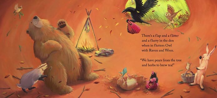
I love Jane's style of illustration and I would say of all my favorite illustrators I think her work influences me the most. She has developed the adorable character of the "Bear" series of bear, wren, mouse, mole, badger, raven, rabbit, and owl. These characters are memorable and recognizable where ever they go. I also love her color pallet of bright happy colors mixed with warm earthy mutes and vibrant greens throughout. Her color choices help to create the mood of each individual illustration and of course the picture book overall.


She works with a limited pallet and I would love to know what colors she uses. Her is her medium and color choices in her own words.
"I work in acrylic paint. I’ve tried other things, but acrylics suit me very well. I never know what I’m going to get at the end, so I can’t do watercolour painting at all! Acrylic is good because there is a lot of freedom to change your mind as your picture progresses. I am wedded to about eight secret colours that I use over and over again, but my palette is only ever limited to four per book. I don’t need any more than that."
I wonder what those secret colors are? I'm going to make a guess (Jane don't get angry at me if I get it right....yea right).
Flake White
Ivory Black
Permanent Green Light
CadmiumLemon Yellow
Yellow Ochre
Sap Green
Lapis Blue
Terra Rosa
Cadmium Red
Shoot! That's 9 colors! Ok, I give up!
Jane says she works mainly with animal characters and in fact considers herself a weak drawer when it comes to drawing people. I would disagree based on this sketch!

I found a wonderful interview with Jane Chapman done by fellow Brit Joanna Marple. You can find the full interview here if you are interested. You can also visit Jane's website here if you want to see all of her work. She actually works with her husband Tim Warnes, who is also an illustrator, and they share a studio, so they also have work they have produced together. You will find his work on their joint website which is the link I provided above.
Well, I hope you have enjoyed meeting Jane Chapman. If you are a picture book fan then you need to go buy some of her books! It will give you something to enjoy till next time when I share my next favorite illustrator with you:) Leave me a comment if you liked this post or if you want to guess at what Jane's secret pallet colors are!
Hi Heather,
ReplyDeleteI'm so glad you like my work. Thanks for writing about my work.
I don't use any of the colours you mentioned in your list, but of course it is possible to mix the same colours in different ways! I don't have a tube of black paint in the house because mixed blacks are so much warmer (heavy on the red, bit less of a deep blue, splash of yellow). I think that a limited palette keeps all the colours working together. Some blues mix great greens, (but terrible purples), and vice versa....
I'm going to get a lesson from a landscape painter next week. There's always so much to learn!
Hi Jane! I am so honored that you read my post! I love your work and cannot say enough good about it! I hope I was accurate in my post (except with the pallet of course! --- heeheehee). Your books have made such wonderful memories for me and my children. Please keep making them!
ReplyDeleteCheers!