Showing posts with label art. Show all posts

Tuesday, January 20, 2015

Doodles

Ok, so when you have to spend a week in meetings, your mind starts to wander...and then your pencil starts to wander...and the result is doodles!  Here are some doodles from this past week...trying to develop some new characters.


Wednesday, October 22, 2014

My First Picture Book Launch!

Yes!  It's true!  I will be launching my first published picture book!  Can you believe it!  Isn't that awesome?  I am working with a local boutique publisher that specializes in publishing local authors and illustrators.  It's being published under the name CrissCross AppleSauce an children's book imprint of Buffalo Heritage Unlimited.  They are publishing my illustrated work for Robert Louis Stevenson's poem called The Swing.  I have shared this project with you before on the blog and this past summer, on a whim, I decided to send it to Buffalo Heritage to see what they thought of it.  They loved it!  And wanted to publish it!  Now I am planning the launch party and release of the book and wanted to share it with you all so you can share with your friends.

Here is the invite I sent out for the launch party with the details....


Please do stop by if you are in the area!  I will have all the original art there, plus some of my artistic influences.  I will also have lots of the early work I did on the book so you can see the steps of the process if you are interested.  There will be coloring pages and bookmarks for the little ones to make, so please bring the family too!

And because children are near and dear to me I can't have a wonderful opportunity like this and not share it with others.   So as a way of giving back, with the launch of The Swing I will be donating 50% of the proceeds of the sale of my books to Feed My Starving Children.  


Feed My Starving Children is a non-profit Christian organization committed to feeding God's children hungry in body and spirit.  Their approach is simple:  children and adults volunteer and hand pack meals specifically formulated for malnourished children.  FMSC then ships those meals to nearly 70 countries around the world and changes children's lives!  It is a wonderful organization that my family and I have supported for 3 years now.  Every year the college where I work holds a two day event where we volunteer and pack around 100,000 meals.


My family and I are doing the food pack event again this year and you can too!  The event is being held November 7th and 8th at Villa Maria College.  If you are interested drop me a line and I'll sign you up!  The money I will donate from my book will go to purchasing the food items and supplies for sending to the children.  If you have a chance check out the link to their site or watch the video above and see what they are all about.

So either way I guess I'll be seeing you!  Either at the book launch or at Feed My Starving Children food pack!


Friday, October 10, 2014

Jane Chapman - Another Favorite Illustrator

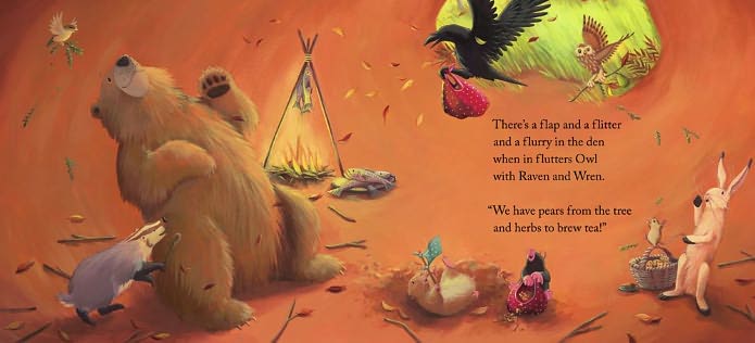
So today I want to introduce you to Jane Chapman (if you don't already know her).  She is the best selling illustrator of "Bear Snores On" and "Bear Wants More" and many more "Bear" books written by Karma Wilson.  I first discovered Jane's work through the "bear" series of books when my kids were younger and I belonged to a children's book club.  I personally love bears, so when I saw "Bear Snores On" I ordered it.  The story is so fun and the illustrations so sweet I immediately fell in love!

I love Jane's style of illustration and I would say of all my favorite illustrators I think her work influences me the most.  She has developed the adorable character of the "Bear" series of bear, wren, mouse, mole, badger, raven, rabbit, and owl.  These characters are memorable and recognizable where ever they go.  I also love her color pallet of bright happy colors mixed with warm earthy mutes  and vibrant greens throughout.  Her color choices help to create the mood of each individual illustration and of course the picture book overall.


She works with a limited pallet and I would love to know what colors she uses.  Her is her medium and color choices in her own words.

"I work in acrylic paint. I’ve tried other things, but acrylics suit me very well. I never know what I’m going to get at the end, so I can’t do watercolour painting at all! Acrylic is good because there is a lot of freedom to change your mind as your picture progresses. I am wedded to about eight secret colours that I use over and over again, but my palette is only ever limited to four per book. I don’t need any more than that."  

I wonder what those secret colors are?  I'm going to make a guess (Jane don't get angry at me if I get it right....yea right).

Flake White
Ivory Black
Permanent Green Light
CadmiumLemon Yellow
Yellow Ochre
Sap Green
Lapis Blue
Terra Rosa
Cadmium Red

Shoot!  That's 9 colors!  Ok, I give up!
Jane says she works mainly with animal characters and in fact considers herself a weak drawer when it comes to drawing people.  I would disagree based on this sketch!


I found a wonderful interview with Jane Chapman done by fellow Brit Joanna Marple.  You can find the full interview here if you are interested.  You can also visit Jane's website here if you want to see all of her work.   She actually works with her husband Tim Warnes, who is also an illustrator, and they share a studio, so they also have work they have produced together.   You will find his work on their joint website which is the link I provided above.  

Well, I hope you have enjoyed meeting Jane Chapman.  If you are a picture book fan then you need to go buy some of her books!  It will give you something to enjoy till next time when I share my next favorite illustrator with you:)  Leave me a comment if you liked this post or if you want to guess at what Jane's secret pallet colors are!


Friday, October 3, 2014

Art Quote Time!

So I felt it was time for another art quote. I'm sitting outside enjoying the final days of summer weather and contemplating what is predicted to be another rough winter.  I love the seasons, I have to admit, but last winter was tough and I'm not sure I'm up for another like that one.  I guess harsh winters make for lots of opportunity to produce art, doesn't it!
As I was contemplating this whole thought I found this quote at mandogtruck.com.  

I love the story of the little prince and the artwork.  


This quote felt apropos for me right now, because I am working on developing a fox
character and this quote was said by the fox to the Little Prince.  Here is the context:

In the Little Prince by St. Exupery, the little prince meets a fox and tells him about a flower on his planet that he cared about but was demanding and irritating as well.  The little prince then saw a field full of identical looking flowers and was dismayed.  "I thought my flower was unique in all the universe" he told the fox.  The fox then helped the little prince to see that his love for his flower made his flower unique to him. The fox then told the little prince his very simple secret: "it is only with the heart that one can see rightly, what is essential is invisible to the eye."  


What I see with my heart is that I love illustration, especially picture book illustration.  Even though there are so many talented illustrators out there who might look just like me, I am still unique in the universe and someone will find my artistic voice essential:)  I have to just keep pushing myself! 


Thursday, September 25, 2014

Catching up!

Sorry I have been silent lately....I have been working very hard to hit a deadline for an exciting project that I am working on!  I will have more news for you on that in a few days (can't spill the beans till I have approval from my publisher!)

In the meantime I thought you might like to know what else I have been doing art-wise.  I started back at the Academy in the beginning of September.   I am taking two studio classes this semester which is really insane!  Studio classes are so much work and I still have my full-time teaching job and my family, but I really wanted to study with both of the professors I have this semester so I decided to suck it up and just plan on a busy fall:)

My first class is a group directed study class which is where I get to work on my thesis project.  I have three separate projects, so I chose to work on the 5 Hungry Mice project this semester.  I think this will be a fun one because as an artist you can make mice look so cute!  I decided to have Paris be the setting of my story and a French Kitchen be the environment the mice would be in.  Here is some research I did on the internet as a starting place for my French kitchen.


My good friend Mary has a wonderful kitchen that I think looks like a French Kitchen, so this summer I went to her house and took a ton of photo reference.  I even brought little stuffed mice to put in the frame. (This was before I made the marquet I posted about earlier).  Here are some of the photos I took of her kitchen.  Isn't it perfect!  Right down to the checked tile and the warm colors!


I am now working on further development of the mice and cat characters and putting them in their environment.  I'll post them next time:)

Thursday, August 14, 2014

Portfolio Reviews - Words of Wisdom

I just had to share this on my blog with you all.  My professor this past semester gave us this quote by Pascal Champion who shares his thoughts on what a portfolio should be and do.  He see tons of portfolio so he speaks from experience.  His words of wisdom are so encouraging and reminds me to be true to myself and my art.  Let go of perfectionism and let yourself shine through your art!

His original post can be found on his Deviant Art journal.  If you click on the link it will take you there.  Or you can read it here as I copied it for you.  Let me know what you think!

You know, I see quite a bit of portfolio on a regular basis, and even more so when I go to comic con and CTN.

This time around was the same thing, I saw quite a few portfolios. Some good ones and some that miss the mark.

There were a few in particular that caught my eye.. a few extremely good ones, and a few that just didn't work, and I wanted to try and share my opinions about portfolios in general.

This is just my point of view, based on MY experience and definitely not a definitely law, rule, or "must do". Just what I noticed in many student's and young professional's portfolios.

The first thing that strikes me is how similar portfolios can be from one student to another..I can almost always tell when one student is from Art Center, San Jose State, Otis, Sheridan or any other major school. It's a good thing and a bad thing. Mainly a bad thing though

Just a few personal thoughts on portfolios since I just came back from comic con and saw a ton over there.

Your portfolio should be a reflection of yourself , not just your skills. When you do a portfolio and go shopping it around, or just ask for some feedback, the person you are showing it to doesn't know anything about you. Doesn't know how long you took to draw this piece or this piece, and quite frankly, does not care. Do you know how long it takes to make a commercial? a movie? does it matter when you are in the movie theater and watching it? The same goes for the reviewer. The number one thing that matters( at least to me) is how enjoyable the experience of going through your work is.

It doesn't have to be funny, or cute creatures.. I very often appreciate portfolios that are fairly gory and bloody, or of other nature, as long as I can relate to it somehow.

The way I relate to a portfolio is through the quality of the images in them..and this is what I consider to be quality work.

1 If you are images tell a story, you are more than halfway there.
2 if your story is crystal clear, you are ninety nine percent of the way there.
3 if your stories are clear and personal, you just broke the house.

You'll notice that neither in 1 or 2 is there any mention of technique… and, oddly enough, there is still no mention of it in number 3 either.
You know why?
BECAUSE IT DOESN'T MATTER!!!

Let me make this clear.
When you are showing your portfolios to people, you are selling ideas and personalities.
Not how you handle Photoshop, or perspective.
Not how you mix your colors, or how many different variations on a tree you can create.
These are exercises you do in school to develop your skills that are used to create stories..which is what I look for.
I am not saying that technique is not important, but I see it as a skill that is very similar to writing.
When you are a kid, you learn how to draw letters, and eventually words and how to write..and you forget about it.
You use that skill to write essays, and novels, and letters to your mom, girlfriend or potential employer.
When you send a letter to a potential employer, you are not showing them how many different ways you can draw the letter A, or B, or Z.
You write ideas.. you try to show this person who you are and what is interesting about yourself.
The better you write, the better you will be able to convey these ideas..but if you have no ideas to convey, all the nice writing in the world won't amount to much.
In a similar fashion.. if your resume is fifteen pages long, most people won't want to read it, especially if you are just showing declinations on the letter M and N, and how well T and H can go together.

Back to Portfolios.
Images are beautiful letters, beautiful words and it's easy to get caught up in the "how it looks" bit..much more than with the alphabet( unless you look at how old Manuscripts were written), but they still function like words and paragraphs.
In some ways, if you use them correctly, they actually function better. If you are careful enough, you might be able to express emotions and feelings that you wouldn't necessarily be able to do with words. You can suggest images that don't exist, and you can make someone feel something… very much like a great writer can create worlds that do not exist.
You can , and you should do that as well in your portfolios.

I understand it is easier said then done, and a lot of you think they have nothing to say.
I disagree.
I think every single person has something to say in a unique way.
Maybe you don't have something DIFFERENT to say, but the way you are going to talk to your best friend ,your mom, a complete stranger about how you feel about ice cream will be different from person to person.
The way you and your neighbor see the sky and the clouds outside your window will be different and unique.

As an artist, you are an author, not just a mechanic.
As an author, you develop your technique to fit your vision.
This is what school and teachers are here for. They are not meant to transform you into an artist… you already are one. They are here to help you develop the tools you need to fully express who you are and what you see.
This is what most people in the industry are looking for.
People who can use the skills they have to share visions.
You need both.
You don't need to possess ALL the skills in the handbook.. that would be impossible because that handbook is being written as you go along.
There definitely fundamentals that have been around for centuries and that will always be around, but techniques change and evolve with you and with society.
The latest software you are going to be be so good at might not exist in three or four years.. but if you are using this software to express your ideas, chances are you will be able to do it somehow with a different piece of software, or a different type of tool altogether.

Last week, I saw two portfolios of note.
One from this young artist from Mexico who could barely speak English.
He did comic books, and was there with his other friend, who didn't speak English Either.
He showed me his work, and was very shy about it.
When I looked at it, my first reaction was.. ha.. this is not my style, this not the "look" I like.
When I read through the first story he had, the hair on my arms were raised. I loved the story.
It was simple, clear, and easy to relate to. it was a love story.. love gone wrong if you want.
Technically, there were some issues in the pacing, there were a few frames here and there that were not totally necessary and some that could have have been totally cut out… but the overall point of the story came across loud and clear and it worked.

His second story was a sci fi story…once again..not my cup of tea..it looked like a mix between Anime and something else that I didn't know and that is not necessarily my favorite type of art.
Here again. the whole story worked, and there were NO WORD BALLOONS. He hadn't had time to put them in.. but the story still worked.
There were again some things that were not necessarily working with layouts and pacing, and the look of it was something way more bloody than I cared for, but it worked.

My feedback to him was that his work was awesome. I saw some issues here and there, but in spite of these, his stories worked very well.
I didn't feel like I should tell him what to fix, because although some parts were clumsy, they were not broken. It was imperfect, but it worked.
The point I am trying to get across here is that even if it's not perfect, your stories, your images can work. And that's really all you can ask for.
Perfection doesn't exist.. we strive for it, but we know that no matter how close we get to this ideal we have, it will always move a little further back, always out of reach.

The other portfolio I saw that made an impression was for the wrong reason.
This young girl who had just graduated showed me her work and everything in the book was an exercise she had done in school.
Technically, it was all good. She actually drew and painted better than me( which happens VERY often) BUT… there was very little personality in the book.
When I see something like this, I usually pick apart the technique because that is the only thing that is presented to me. And that is what every recruiter will do..if you just show him how well you draw your O's and your T's, they will just look at that, and not at the bigger picture, they won't read the text and will just get very nit picky on those things.
That's what I did.
I also encouraged her to put all that aside and to use her own experiences in life to come up with stories that she could put in images…and make them as honest to what she felt as she possibly could.
This girl has so much skill, but it seems that along the way she forgot to use them for what they were meant to be used.

And that is what I see a LOT in portfolios.

So..
This my advice to you guys when you are prepping your portfolios, when you are in school,when you are relying on your teachers.
Remember WHY you want to be artists. Remember that you ( most likely) were draw to this because of the cartoons, comics, films you have seen as a kid that made you laugh, and cry, and wonder.
Remember that your teachers are there to help you but they won't transform you into artist. They can just help you find your way, and develop the tools you need to get there.
And remember that you are special and unique. That even if everybody else in the class, or around you can draw better, color better , animate better than you, it's about what YOU are going to do with your skills that matters, not how many skills you have.
And that's what you should be showing the world.

There.
That's my two cents.
Once again.. that is just MY point of view.
I am sure many many people will have different opinions, sometimes contrary ones, but this is what I think and this is what works for me.
P.

Friday, May 23, 2014

Color Finishes

So here is the moment you have all been waiting for……my color finishes or final art.  At least it's final for now until I get some feedback that makes me decide to change them:)  My professor helped me chose the 4 strongest compositions from my dummy book and those are the ones I finished first.  I had done the cover illustration last semester so I include that with these since it set the color pallet and tone for the artwork.  As I mentioned before, I have three more I want to finish off.  They are the "cow" scene, the "dog and squirrel from above" scene and the "boy flying" scene.  You can check these out in my color studies post which preceded this post.  I figure these additional scenes will give me a nice variety of angles, perspectives, and characters to chose from for the final 5 that I will use in my final thesis.

These are mixed media paintings done on illustration board.  They all measure 12"H x 22"W.  I little bit about my process…

I transfer the drawing onto the illustration board with graphite.  Then I paint in local colors with watercolor to get the values and approximate colors.  I know I can always change these a bit so it helps me to see whether I have made them too saturated or too light.  Then I put an oil wash over the whole painting and remove it with tissue in areas where I don't want it, paying attention to shadows and form. When it's dry I go back in with oil paint preserving what I like from the underpainting and covering up or enhancing areas where I want to draw the eye.  I then use prisma color pencil to add the fine details I can't get with the brush.

So here they are!  Let me know your thoughts.  I'll post the next three when I have them done.


Wednesday, May 21, 2014

Color Studies

Here are the color studies I did for my picture book "The Swing".  Some are done in prism color marker and some are done in prisma color pencil.  I think I like the pencil versions better so that may be my tool of choice for future projects.  I didn't do a color study on every page yet, just the ones I want to take to finish.  I'll eventually do them all so I can show it to a publisher, but for now here is what I have.   Let me know your thoughts.


Monday, May 19, 2014

Book Dummy

Ok, so many of you know that I am working on a picture book as part of my studies at AAU.  I actually will illustrate three picture books in total, but only 5 fully finished illustrations from each manuscript.  One picture book, however, I have a personal soft spot for and so I decided to illustrate the whole thing!  That means I need to create a book dummy for the whole thing.  A book dummy is a value study layout of each page.  It helps you to see the flow of the book, determine she sequence of images and maintain the consistency of the characters.  I worked for most of the semester this winter/spring on creating my book dummy.  It still needs a few tweaks, but at least for now, it is in a close to finished state so I thought I would post it for you.  I'll post the whole dummy as a storyboard and then each page so you can get a feeling for how the book will flow.


Cover

Copyright and Dedication Page

Title Page

Wordless spread to establish environment


Wordless ending page


I'll post my color work next time!


Thursday, March 27, 2014

Raven Study


For the picture book I am working on I have included a raven as a character.  In preparing my character studies, my professor suggested I study ravens a bit so I can understand their shape, coloration and character.  I did a lot of internet research on all kinds of image sites and found many pictures of ravens. They have a very distinctive shape and I was intrigued with this.  They are also portrayed a lot in artwork, and are revered by many cultures and people groups.  

Here is a list of roles of the raven from the blog http://www.scavengerart.com/raven.html

Since man’s earliest history the Raven and Crow have held a high and honored position in our mythology and spirituality.
The Norse God Odin had two ravens, “Thought” and “Memory”, which he would send to fly around the world each day so they could report back to him events as they unfolded.
Native American tradition holds the Raven~Crow as the courier of energy flow that brings about change and creates new realities. The raven, being black, is associated for them with the “void” from which all energy flows.
Northwest coastal tribes believed Raven was the creator of the Heavens, the Earth and the Sea. It was he who brought forth the light and lifted us out of the darkness. He was very wise but he was also known to be a “trickster”.
Aesop's "The Crow and the Pitcher" illustrates Crow's intelligence and how "necessity is the mother of invention".
For Southwestern Native Americans the Raven~Crow was their “Storyteller”. Passing down knowledge and wisdom from generation to generation through myths, stories and parables. Listeners beware! Raven was also a trickster, one could never be sure if the story he told was a simple truth or held some more mischievous lesson....
Ravens are considered by many to be the most intelligent of the birds, and they are known for collecting bright, shiny or colorful objects to decorate their nests.
The key Raven/Crow holds symbolizes the opening of doors and the welcoming of positive change into our lives.
When Raven/Crow is perched on a ball he serves as a representation of living in balance.  If he is perched on a heart, it is to help us remember that which is most important in our lives.
Raven/Crow sometimes holds a pair of dice to symbolize chance or fate.  If he holds an old watch it is to remind us of our place in the universe and to live in the moment.  Of if Raven/Crow holds a compass it is to help us find our way or to give us direction.
Based on all my research, I did a few paintings of ravens last week.  I was focusing on their shape and variation of color.  While they are generally black, upon further study of them you find blue, purple, magenta, and even some green in their feathers, picking up colors from things around them.  I have one more raven on my easel but thought I'd post these for now since I haven't posted in a while.   Let me know what you think!


Monday, January 20, 2014

Buffalo grey …….need some color!


Winter in Buffalo can be described with one word….grey!  We have had no sun and lots of snow for way too long now.  So when I got a chance to paint this weekend I just had to paint color!  Lots of it!  It was so refreshing to see the blues and reds and oranges and greens on my canvas.  My pallet was just as beautiful as it had the mixtures of all these colors.  I especially loved the permanent green light mixed with a little cadmium yellow light…such a beautiful spring color!  So for all you who also know winter to be about grey I thought I'd post my painting for you to enjoy.  This one is going front and center in the kitchen of my house so I can see it every day till the real thing arrives:)  Enjoy and let me know what you think.

Friday, January 10, 2014

Illustration Friday!


Here is my post for illustration Friday's topic of "time".  This is called Hopscotch Time!  This painting was done in acrylic on board.  Enjoy!