Tuesday, December 31, 2013

Swing into the New Year!

How would you like to go up in a swing,
up in the sky so blue…
Oh I do think it the pleasantest thing
ever a child can do!


To start off the New Year I thought I'd post my final illustration from my Children's Book Character Design class that I took at the Academy of Art this past semester.  This is a page from a song that I am illustrating for my thesis project.  I hope to do 5 - 6 full illustrations for this song, plus some spot illustrations.  This is the first one.  I like how happy it turned out.  I don't think there can be anything happier than the feeling of swinging on a swing when you were 5 years old….I thought it was also an appropriate image to bring the new year in with since he is so Happy!

I thought you might also like to see the process of getting to this image including the development of the characters…..

Character line up….the raven is a surprise character that you will have to be looking for to see where he shows up in the story:)


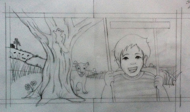
Initial composition done in graphite on vellum.  Only a rough sketch.


Value study done in prismacolor marker on paper.


Color study #1 done in prismacolor marker on paper.


Color study #2 done in prismacolor marker on paper.


Final illustration in process.  This is painted on illustration board in acrylic paints first.  I then apply a wash of oil in burnt sienna.  From there I work in oil paints, prismacolor pencil and pen and ink to create a final illustration of mixed media.


And then finally the final illustration.  You can see that I make a few changes along the way.  I decided to close his eyes because it helped communicate the feeling of pure joy.  I also added leaves the the tree, flowers in the grass and  tall weeds, and a few toys for the dog "Bean" to play with.  My instructor also gave me some great feed back on the values and the sky which I incorporated.  All in all, I'm happy with the final.  The text is added in photoshop afterwards, but the painting itself has not been altered at all digitally.  


I'd love to know what you think of this illustration, so drop me a comment below!  
And Happy New Year!

Wednesday, December 25, 2013

Words on Pictures

Merry Christmas!

Christmas day is usually a very busy day with opening of gifts, eating of great food and visiting with family.  We did all of that today plus some!  With all that was going on, for some reason  I was thinking of this short story that I read in the Provincetown Art Guide.  I'd like to share it with you here.

EXT.  PROVINCETOWN NEIGHBORHOOD - 1950 - DAY

Nestled between a stretch of cottages and an expanse of sand dunes is a flat, open field bisected by railroad tracks.  The trains no longer run here, so the ties and rails are overgrown with beach grass.

At the "end of the line" is a lone abandoned railroad car - an orange-painted CABOOSE that was once used as a freight office.  Its sheets have been braced and a makeshift stairway leads to the rear door.

We notice smoke rising from a stove pipe on the roof…

George Yater - watercolor on paper


INT. CABOOSE - DAY

A fire roads in a tiny wood stove and a pot of coffee warms on a burner.  There's a small table and a couple of chairs, a cupboard with canned goods, a wash basin and pitcher, and a shelf with an il lamp and a few books.

Someone has transformed the old "freight office" into a Spartan residence.

In a far corner is a sleeping cot and a MAN makes the bed with military-like precision.

He is in this early 60's body  lean and well-muscled.  The kind of body you get from years of tough, physical labor.  His cold blue eyes and shock of close-cropped white hair stand in stark contrast to a deeply tanned leathery face.

This is a hard man who's lived a hard life.

He begins to pour a cup of coffee, but pauses when he glimpses something out oa small, smoky window.  He returns the pot to the stove, the cup to the table.  From under the cot he retrieves a RIFLE.

EXT. CABOOSE _ DAY

It's damned cold outside, but the Man, only in a T-shirt and dungarees, is oblivious to the frigid temperature.  Moving quietly, but with great purpose, he descends the makeshift staircase and searches the nearby sand dunes…

EXT. SAND DUNES - DAY

Weaving through the grass is a FOX, and when it sees the Man, it freezes.

EXT. CABOOSE/SAND DUNES - DAY

The Man aims the rifle…But when he sees THREE FOX KITS running to catch up to their mother>>> He can't shoot.  He just can't.

The fox and her kits disappear into the dunes and the Man turns to the west.  The sun is so bright he has to shut his eyes.  Now feeling the chill, he shivers and hurries back to the warmth of the caboose.  Before entering, he steals one last look at the dunes… and sees nothing but a vast expanse of sand and beach grass.  He betrays a hint of a smile and returns to his coffee.

Written by Mark Protosevich

Here are some fox illustrations I did…


Sunday, December 22, 2013

Missing Grandpa...

It's been a crazy few weeks as is always the case at this time of year.  But even more so because of a family loss.  My beloved grandfather went home to be with Jesus on December 17, 2013.  We are so happy for him for we know he is reaping his reward, but we are of course sad for our loss and sad that grandma is without him for the first time in 86 years!  They met when they were 8 years old and have been together ever since!  I wanted to share this beautiful song that we played at the funeral.  Grandpa called it "our song" for he and grandma.  I had the privilege of reading the "spoken word" part at the funeral.  Please take the time to click the link to see the youtube video.  It is such a great testament to my grandfather and his love for my grandmother:)


Friday, November 22, 2013

Illustration Friday!


Yep!  It's Friday again!  Whew!  What a week.  So nice to sit in my studio and think creatively after the hustle and bustle of a busy week with family and work:)  This week's topic for Illustration Friday is tail.  It made me think of the little mouse I developed by the name of Courage.  He is an adventurous little mouse who is always looking for some new to do.  I created him a few summers ago after I was inspired by a wordless picture book I bought.

I loved the artwork and the illustrator's ability to tell a complete story without any words.  I wanted to try my hand at it.  I decided to create a character who could easily travel the world without needing airplanes, cars, boats or trains.  That meant he had to be small, so a mouse.  How could a mouse travel easily?  Well, what if he grabbed a leaf and used it as a parachute that could catch the wind and lift him up?  Voila!  Courage was born:)   I envision Courage using his leaf to take him to far away places where he can see new things and meet new people.  Places like San Francisco, NYC, Paris, London, Egypt, Africa, New Zealand, Patagonia and the Himalayas.  Some places I have been, others I want to go to.  I could research this places and have Courage see the sites for me either high above from his leaf or on the ground.  The ideas are so vivid in my mind, I just need to get to it and create the art to show it all!  In the meantime….here is Courage!


Friday, November 8, 2013

Illustration Friday! - Secret

It's Friday again!  Best day of the week!  That means it's time for Illustration Friday!  This week's topic is "secret".   My illustration this week is a little autobiographical…it represents the two worlds of my art life.  I'm a little bit of a split personality and can't decide which type of art I like best.  I liked the idea of two doors representing that decision and having each door allude to what might lie behind.  One door is labeled Fine Art and it looks like a clean gallery entrance.  It is sophisticated and refined and is minimalist in it's presence.  The other door is labeled Illustration and it looks much more interesting!  It has doodles and drawings and is littered with signs.  It even has a top secret sign on the door!  Which door would you choose?


Monday, October 28, 2013

Illustration Friday!!! Creature

This week's topic for Illustration Friday is creature.   My first interpretation for creature was monster.  Since I LOVE Halloween….it's one of my favorite holidays, I have done monsters before.  Some are actual monsters and some are children dressed as monsters.

Now let me give you a bit of history with me and monsters.  About 2 years ago I discovered a wonderful illustrative treasure called Sketchtravel.  It has illustrations from over 70 artists from the world over.  It is a great book and truly an inspiration to me.  And the proceeds went to a good cause!  If you get a chance pick it up!

In Sketchtravel I discovered an artist whose work I fell in love with….Michael Knapp.  As I pursued his web site, which can be found at www.michaelknapp.com , I found the greatest illustration of a monster that he had done.   This little monster inspired me to do one of my own.  I used several references to develop my monster monster including a cupcake recipe, my kids imaginations and my dog's tongue to create my "creature".  Hope you like him!


Monday, October 21, 2013

Expressive Characters

The past two weeks I have been working on developing one of my character's further....a 4-yr old precocious little girl who I haven't named yet.  Since I am still developing her, I haven't found the right name yet, but I am open to any suggestions!  Just leave them for me in the comment section below this post:)

I spent one session working on developing her character and attitude through her body language and I spent the next session developing her through her facial expressions.  Since I want to use her in a children's picture book, the more expressive both the body and face are, the better!  The more gesture I can put in her body through the flow of her spine and the more action I can put in her posture the better she will read in a picture book.  Additionally, the more expression I can put in her face with eye and mouth placement and the more attitude I can give her with her head and neck positioning, the clearer her emotions will read on the page of a children's book.  So here is my work on her so far....let me know what you think!


Friday, October 18, 2013

Moustache Friday!

This week's topic for Illustration Friday is moustaches!  This is an illustration that I did earlier this year. I was thinking of the moustache of a walrus when I painted this, so I think it really fits for moustache Friday!  Enjoy!  Be sure to check out the other moustache submissions by artists from around the world at Illustration Friday!


Wednesday, October 9, 2013

Harry Potter, Spiderwick, and Little Red Riding Hood Teenagers

This week we were working on drawing characters who are teenagers.  Understanding their proportions and the fact that they are not yet adults, so they don't have all the angularity of adults, but they are no longer children so they are not quite as soft and curvilinear.  Actually, teenagers are a lot of fun because they have aspects that to their growth that illustrators can exaggerate...like big ears, feet, and hands on boys, and full hips and lips on girls.  This was my first attempt at drawing teenage characters so I'm not sure I pushed all of those areas enough, but I did get some drawings that are fun to look at:)

The first series of drawings were done from photoreference that the Academy provided me.  They do a great job with the costuming of people so we had a pouting girl, Little Red Riding Hood and a Harry Potty like character.  Here is how mine turned out!


The second set of characters we had to chose a manuscript that had teenage characters and then reimagine them.  I chose the Spiderwick Chronicles because I not only love the stories I love the art of Tony DeTerlizzi!  So here is Mallory and Jared Grace.  I used my twins to be the models and aged them appropriately to play an older teenage girl and a tweenage boy.  Let me know what you think!


Friday, October 4, 2013

Illustration Friday!

This Friday the theme for Illustration Friday is underwater.  I immediately thought of polar bears since they love to swim underwater:)  And I like to paint bears.  This bear was inspired by a National Geographic photographer named Joel Sartore who did a whole series of animals.  His work can be found at photoark.com  I gave myself only 1 hour to work on this so I wasn't going for perfection but just gesture and fun.  I also used a few filters in photoshop to help fill it out.  Hope you enjoy!  Let me know what you think.

Underwater   


Monday, September 30, 2013

Illustration Friday!!!!!

I love social media!  I used to think that I didn't love it because it was so new and time consuming and I couldn't make sense of it:)  But after some research and many interviews with people who are using it I find that I love it.  One of the things I love is discussion forums.  I found many relevant discussion forums on Linked-In and the one I have been dabbling in most recently is "Children's Books".  On "Children's Book" discussion forum I heard about "Illustration Friday"  a great website for creative people like me and I bet you too!    In their own words...."Illustration Friday is a weekly drawing challenge and participatory art exhibit brought to you by Illustration Age. Every Friday a new topic is posted (based on topics you suggest!) and you have one week to come up with your own, unique interpretation.  Anyone who likes to draw, paint, sculpt, doodle or color can participate in Illustration Friday."  When I saw this description I knew it was for me!  Here is a link to their site.... Illustration Friday   This gives me a great way to practice and doodle with illustrations without the pressure of an assignment or client to please:)  This first week is 

Onomatopoeia...

Onomatopoeia is when a word’s pronunciation imitates its sound.  


So here is my first submission.  It's a piece that I did about a year ago but I thought it fit for this assignment and would get me started!  I'm counting on you to keep me honest and posting weekly:)


Tuesday, September 24, 2013

More Character Studies

This semester I am stretching myself and focusing on development of memorable characters.  This is not an area that I have a lot of experience in, but one I want to get better at, especially since I would like to do children's picture book illustration!  I am taking a class this semester at AAU with an instructor whose work I love!  We have only had two weeks of class but we are already developing full characters.  I am really trying to think about making the characters I draw memorable, lively and relatable to my readers.  This week we were asked to create a character with different "costumes".  I interpreted this a little more literally and put my character in "costumes" similar to the boy in the wolf costume in Maurice Sendak's "Where the Wild Things Are".


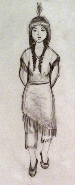
So I chose the character Tiger Lilly from the story of Peter Pan.  She is the Native American that Captain Hook is always stealing and tying up for Peter to come rescue:)  Tiger Lilly is a spunky, spry character that I imagined would be full of ideas of how to get away.  So I drew her in her native costume and gave her a sweetness.  Then I dressed her as a pirate, thinking, since the pirates keep stealing her maybe she would dress up as a pirate to get away.  I gave her attitude as a pirate since she would need that to hang with Hook's men.  Lastly, I drew her dressed as a fortune teller where she could use her fortune telling powers to mesmerize Hook and make her escape!  Below are the drawings.  Let me know what you think!


Sunday, September 15, 2013

More drawing

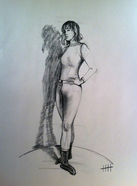
So here are my two other projects that I worked on this weekend.  The first is a series of 5 clothed figures drawn from all angles.  I did these in charcoal on newsprint from photoreference that was provided to me.  I was looking to get the proportions accurate, a likeness, and consistency of character from pose to pose.


These poses were a warm up exercise for my next project which was to develop two characters, a male and female, and draw them from front, side and rear view.  The characters should be recognizable and clothed and accessorized appropriately, but we were given some flexibility in proportions to help make the character memorable.   I chose to do a Flapper girl and a Chef.  Here they are.  Enjoy


Saturday, September 14, 2013

A weekend of drawing!

I have been drawing all weekend working on three different projects...so I have lots of artwork to update you with:)  The first is for my thesis.  I have been studying and drawing mice for my children's book "Five Hungry Mice".  Here are my quick studies.  I need to do more but here are my first few pages.


my husband interrupted me in the middle of my post for a trip to 7-11 for slurpies.  Since it was 10 pm on a Saturday night I just had to go to see who exactly is at a 7-11 at that time of night.  We took the whole family, my three kids, and my nephew who was visiting.  Guess what....we were the only people at the 7-11 at 10pm on a Saturday night!  The cashier was eyeballing us quite a bit, I think he thought we were going to steal our slurpies.  We paid in full, so here is the Slurpie I got to prove it!


Saturday, August 31, 2013

Looking for my big idea....

I love to tell stories.  I think it's part of my heritage.  My father is a storyteller too.  We grew up with the anticipation and fun of dad telling a story almost every night at the dinner table.  The stories weren't pre-fabed or purposefully thought out to impress us.  They were just the everyday happenings of a carpenter as he worked with a crew of men.  But the way he told them were engaging and funny and kept you wanting to hear more.  He also admired great storytellers and would memorize passages of their works and recite them on occasion.  The works of Robert Service were some of his favorite and I can almost recite the whole "The Cremation of Sam Magee" myself!

So when considering what is it that I bring to the world, that I would like to share with others, I think it is storytelling.  But being such a visual person I like to add the pictures I see in my head when I tell a story.  That's where my art comes in....  So when considering what I what to communicate through this blog and through my art I think about how much stories move me and how I want to share that with others visually.   To create a sense of awe, or wonder, or just happiness in others through a story that is told with pictures is the mark I would like to leave.  So I began looking for inspiration in quotes about storytelling that might sum all of that up better than I just did.  I found this quote and really liked it because it speaks to the simple joys that make life special, that make us happy, that make us well.... like storytelling.  I hope you enjoy it to.

.... if you came to a medicine person complaining of being disheartened, dispirited, or depressed, they would ask one of four questions: When did you stop dancing? When did you stop singing? When did you stop being enchanted by stories? When did you stop finding comfort in the sweet territory of silence? ”
— Gabrielle Roth
reposted from: http://storytellingquotes.tumblr.com

Wednesday, August 28, 2013

Thesis Beginnings

Great News!  After lots of discussion and advice from my advisor, program director and committee members, I received approval to proceed with my thesis idea of putting children's songs into picture book format for my MFA.  I appreciate the feedback I received from my committee and the time I had to rework my idea so that I can make the best picture book art I can.  I am targeting the preschool to early reader market and chose songs that would be appropriate for those markets.  One of the songs is about 5 Hungry Mice and a Box full of rice.  I'm very excited about this project and have begun some work thinking about one of the first full spreads that shows the 5 hungry mice and the box full of rice.  I have also been looking at and drawing mice!  Here are my fist three ideas done in a value study.  I would love to know which one you like the best or any suggestions you have for improvement for me.
Thanks!


The above shows a few thumbnails of ideas.  I went on to shoot photoreference of these and then chose three to turn into the value studies for the spreads.  In the studies I was working with three values alternating warms and cools to try and keep the value pattern simple and to lead the eye through the composition.  I can always find areas for improvement in my work, but would like your thoughts as well since sometimes we get so close to our work we can't see the obvious.  Thanks for your help:)


Sunday, July 28, 2013

East Aurora Art Show

I'm late with this post as well....but at least here it is!

At the end of June I participated in the 60th Annual East Aurora Art Society Art Show.  I participate in this show every year and I always choose to do the snow fence instead of having a tent.  I love the snow fence and the other artists who show there.  We are laid back and fun loving and don't feel the pressure that the people in the tents do to have a perfect display.  Nothing, and I mean nothing hangs straight on a snow fence!  This year there was rain forecasted which always puts a damper on everything and makes it hard to keep your art dry.  Over the years we have all come up with different systems to shelter the art from rain....large umbrellas, plastic drop clothes that can be pulled up over the art, finding a spot under the trees and hoping for the best....

It did rain on Saturday morning, so I had to get creative with my art covering.  I'm glad I pain in oil so a few drops of water doesn't mean a complete destruction of my artwork.  Here you can see my pice of the fence and my drop cloth.  Plus I was also a little creative with the tree that was on my space and used it as a shelter for myself as well!  I even made the local paper because the photographer thought it was a great idea!


I also had a nice surprise when I entered a piece into the judging.  There is a first, second, and merit award for the many different media that are present in the show, and then there is a best in show award. I entered my Summer Dreams painting in the oil category and it took first place!  I was thrilled and honored to be given the recognition by the jury.  The second day was full sun and we had lots of people come out.  My family came out to visit so I got to take a picture of the model (my daughter) with her award winning painting.  I met with old friends and sold several paintings and had a great time on the snow fence.  Definitely doing it next year!


Tuesday, July 16, 2013

Handmade Picture Books

Well, as promised in my previous post, here are the hand made picture books I made for my opening at Villa Maria College.  They are board book style, so small and chunky for little hands to love!  I printed the original art out on giclee quality rag paper and then adhered them to the boards and assembled them into a book.  For my first try it wasn't bad, but I want to try and improve my process.  So here are some images of the books themselves and also a few pictures of the art.  I won't show it all here because then you'll have incentive to come and visit my studio and see them in person!  Enjoy!!